Idealize
Book a scoping call
The work

Real clients. Real launches.

Nothing invented. Every project below was paid for, built and shipped, and the ones still online are linked so you can open them yourself. Some predate our move into product work; the discipline is the same.

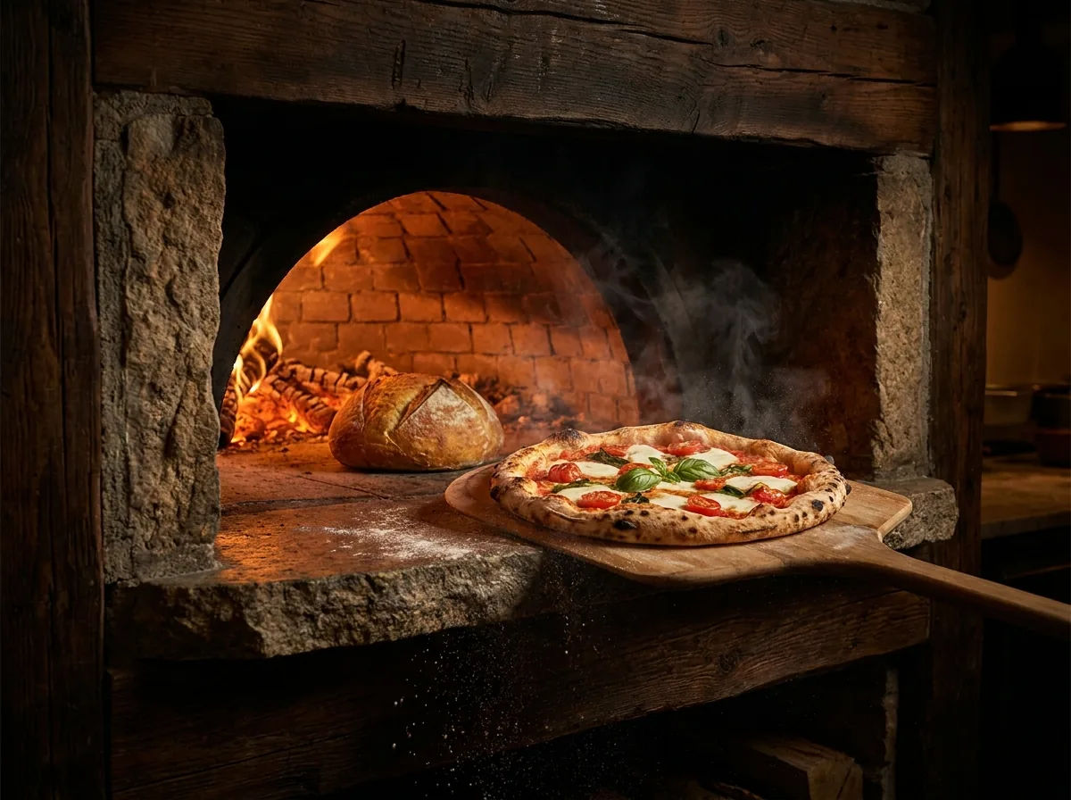
The Atlas statue holding up the bar at Hornofino Bayamón Visit live site
Web build · Bilingual'25

Hornofino

Hornofino had what most businesses want, a product people love, and nothing sitting between that product and the customer. We built the whole front end from a blank page: a catalogue that changes without a developer, the brand's warmth translated into type, colour and motion, and one unambiguous path from "just looking" to ordering.

Built phone-first and fast on island cellular, because that's the device and the connection the order gets placed on. Then kept moving with promotional pushes built to bring people back, not just to be looked at.

  • Front-end design & build
  • Catalogue structure
  • Bilingual copy EN/ES
  • Search foundations

The customer-facing surface a good kitchen deserved: fast, phone-first, and pointed at an order instead of an impression.
Not software · Bilingual content system'25

Recinto de Ciencias Médicas · CEMI

For the Centro de Estudios Maternal Infantil at the Recinto de Ciencias Médicas, the brief carried real weight: health communication for families, where clarity is the entire job. We built a repeatable bilingual content system of templates, rules and one consistent voice, so important information reads as approachable instead of clinical every time, not just when someone talented is free.

Every word was checked before it went out, every piece reviewed against what the clinicians would stand behind, and the templates stayed with the department after we left. A university medical campus is an unforgiving place to work loosely. That habit came with us into the product work.

  • Bilingual content system
  • Templates & standards
  • Copy EN/ES, natively written
  • Review & coordination

Communication a university medical campus can stand behind: warm enough for families, precise enough for medicine.

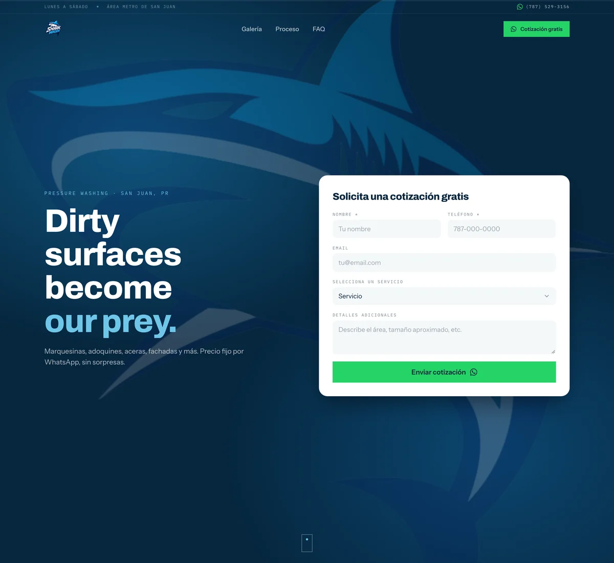
Shark Wash PR: the hero washed clean, the shark mark behind the free-quote form
Web rebuild · Motion system'26

Shark Wash PR

Shark Wash pressure-washes marquesinas, adoquines and fachadas across the área metro de San Juan. The whole business is the difference between two photos, and the site they had was showing that difference as a grid of thumbnails. We rebuilt the front end around it: the same words, the same palette, an entirely different experience of them.

The hero opens under a film of grime that the page washes off itself, and that your cursor can wash off too. The gallery became a drag comparator, so before and after are one image you pull apart with your thumb instead of two you compare from memory. Every way out of the page lands in the WhatsApp thread the owner already answers from. Delivered as a package he hosts and updates himself, instructions in Spanish.

  • Immersive interface
  • Motion & interaction engineering
  • Before & after comparator
  • Performance budget

A business that sells before-and-after, finally built so you can drag the line yourself.

Positioning · Launch groundwork'24

Hoppeo PR

Before the interface, before the pricing page, before a single sign-up, something has to know what it is and who it's for. With Hoppeo PR we worked at that foundation: positioning, voice, identity direction, and the groundwork a launch stands on.

It's the same question that decides whether a product ships or drifts: what is this, and for whom. Get it wrong and you spend the build arguing about features. Get it right and the roadmap mostly writes itself. Least visible work we do, most expensive to skip.

  • Positioning
  • Voice & naming
  • Identity direction
  • Launch groundwork

A launch that knows exactly what it is, so everything built after it pulls in one direction.

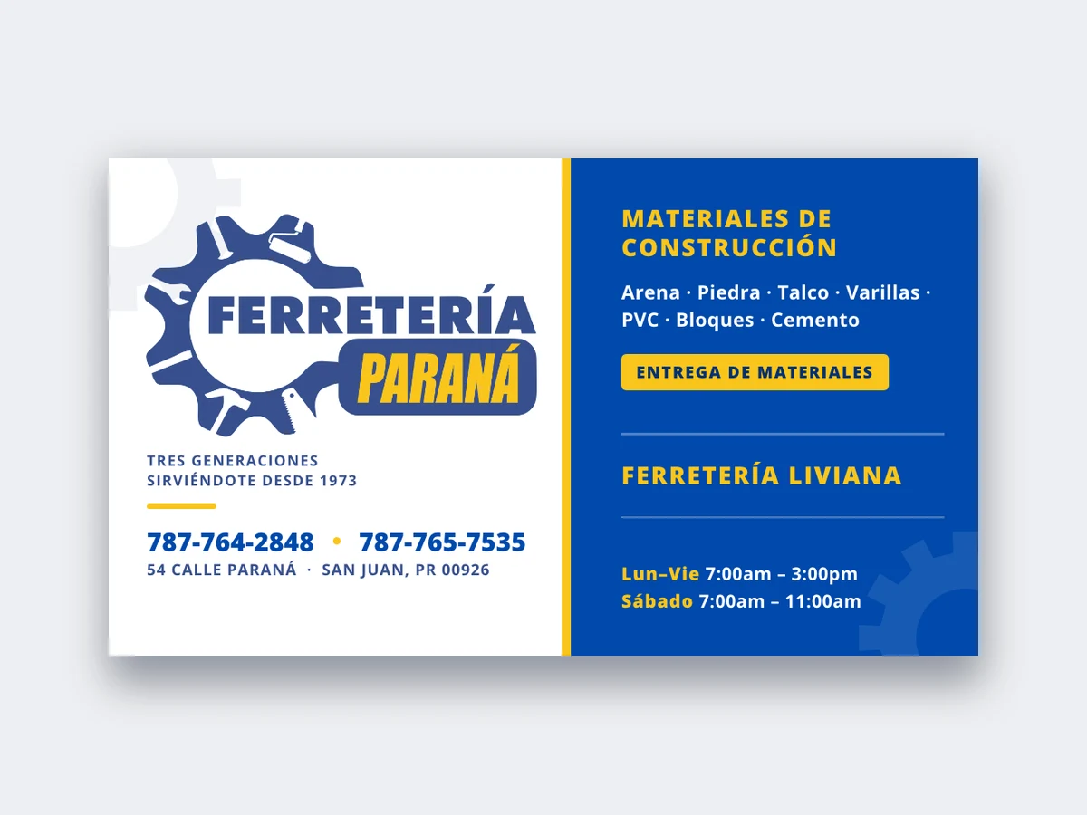
Ferretería Paraná: presentation card design View the cards · PDF
Print · Brand Collateral'26

Ferretería Paraná

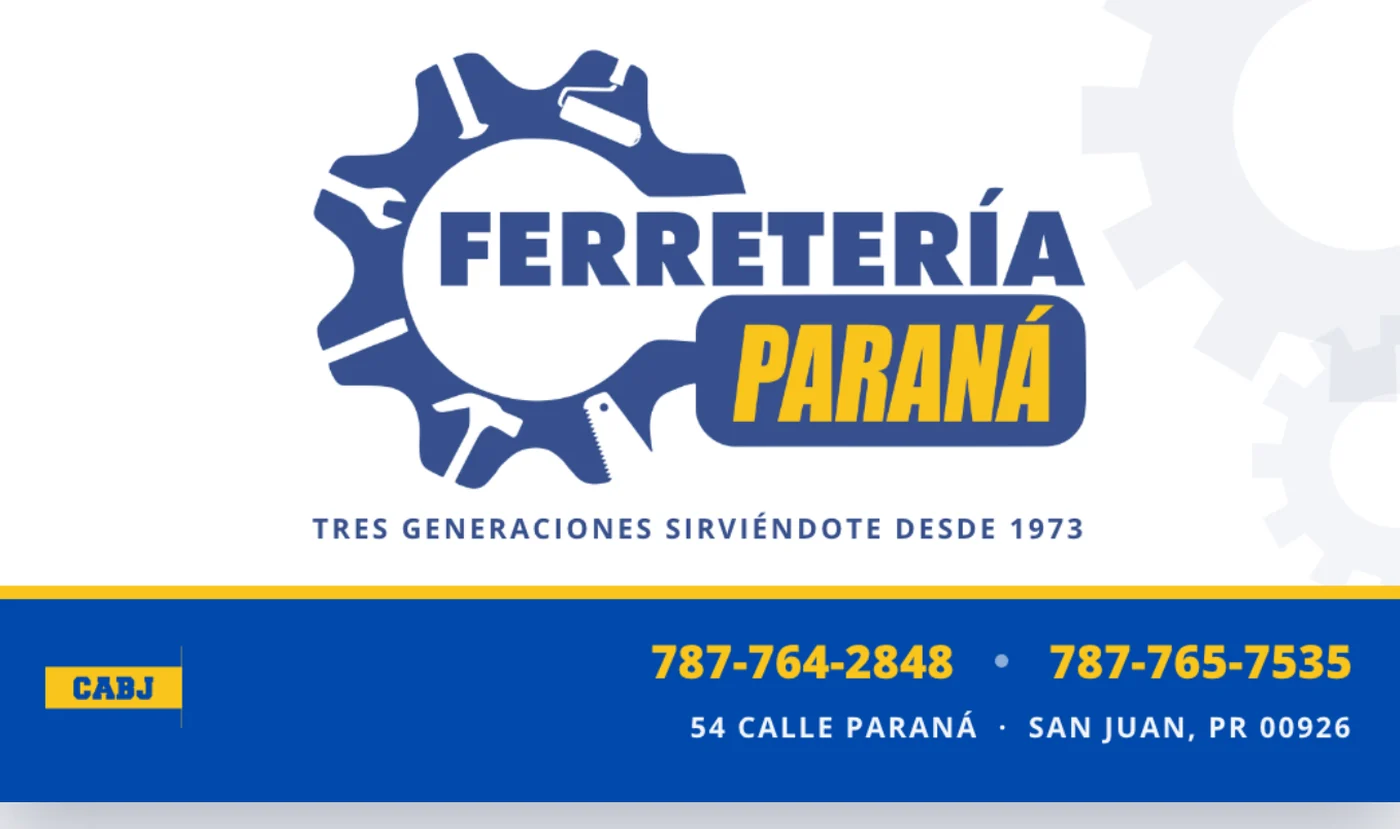
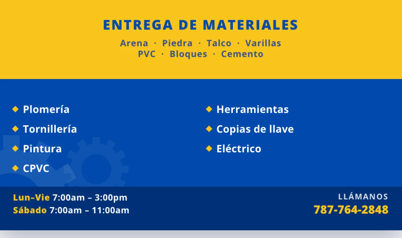
Three generations of the same family have run Ferretería Paraná in San Juan since 1973: construction materials on one side of the counter, light hardware on the other. What they didn't have was anything to put in a customer's hand. We rebuilt the logo as clean vectors from the storefront sign, then designed their presentation cards from scratch.

Not everything we ship runs in a browser, and this one is here on purpose. Print has no second deploy. Once it's on the press it's final, no hotfix and no rollback. We delivered two press-ready versions with bleed, crop marks and 300 dpi throughout. Working that way is a good habit to bring back to software, where the safety net makes carelessness cheap.

  • Print design
  • Logo vectorization
  • Press-ready artwork
  • Brand collateral

Three generations of reputation, finally in a customer's pocket.

Ferretería Paraná two-sided card, front face with the vectorized gear logo, tagline, and contact strip
Two-sided version · Front
Ferretería Paraná two-sided card, back face with the materials delivery service, hardware inventory, and store hours
Two-sided version · Back

Different clients, different jobs. One standard.

The product itself Accounts & permissions Interface & design system Billing & subscriptions Integrations & APIs Automation AI features Analytics White-label Hosting & security Onboarding & migration
The next case study

Could be yours.

Tell us what's stuck in a spreadsheet, a notebook or a WhatsApp thread. We'll show you what we'd build.

Book a scoping call

30 minutes. No pitch, no pressure, and a build plan you keep either way.

© 2026 The Idealize · San Juan, PR